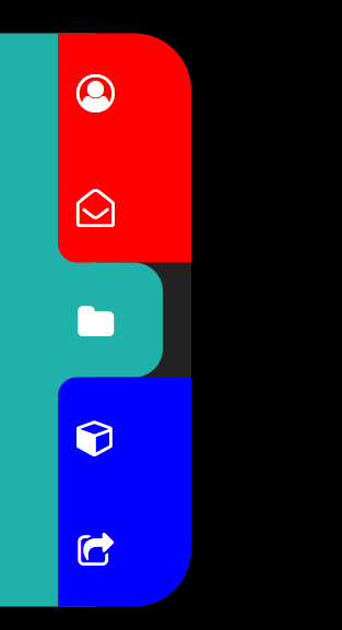
效果展示

代码
HTML 部分
1
2
3
4
5
6
7
8
9
10
11
12
13
14
15
16
17
18
19
20
21
22
23
24
25
26
27
28
29
30
31
32
33
34
35
36
37
38
39
40
41
42
43
44
45
46
47
48
49
50
51
52
53
54
55
56
57
58
59
60
61
62
63
64
65
66
67
68
69
70
71
72
73
74
75
76
77
78
79
80
81
82
83
84
85
86
87
88
89
90
91
92
93
94
95
| <!DOCTYPE html>
<html lang="en">
<head>
<meta charset="UTF-8">
<meta http-equiv="X-UA-Compatible" content="IE=edge">
<meta name="viewport" content="width=device-width, initial-scale=1.0">
<title>伸缩式菜单</title>
<link rel="stylesheet" href="https://cdn.staticfile.org/font-awesome/4.7.0/css/font-awesome.css">
<link rel="stylesheet" href="1.css">
</head>
<body>
<div class="container" >
<li style="--h:0%;">
<a href="#">
<i class="fa fa-user-circle-o" aria-hidden="true"></i>
</a>
</li>
<li style="--h:20%;">
<a href="#">
<i class="fa fa-envelope-open-o" aria-hidden="true"></i>
</a>
</li>
<li style="--h:40%;">
<a href="#">
<i class="fa fa-folder" aria-hidden="true"></i>
</a>
</li>
<li style="--h:60%;">
<a href="#">
<i class="fa fa-cube" aria-hidden="true"></i>
</a>
</li>
<li style="--h:80%;">
<a href="#">
<i class="fa fa-share-square-o" aria-hidden="true"></i>
</a>
</li>
<div class="top"></div>
<div class="middle"></div>
<div class="bottom"></div>
</div>
</body>
</html>
|
CSS 部分
1
2
3
4
5
6
7
8
9
10
11
12
13
14
15
16
17
18
19
20
21
22
23
24
25
26
27
28
29
30
31
32
33
34
35
36
37
38
39
40
41
42
43
44
45
46
47
48
49
50
51
52
53
54
55
56
57
58
59
60
61
62
63
64
65
66
67
68
69
70
71
72
73
74
75
76
77
78
79
80
81
82
83
84
85
86
87
88
89
90
91
92
93
94
95
96
97
98
99
100
101
102
103
104
105
106
107
108
109
110
111
112
113
114
115
116
117
118
119
120
121
122
123
124
125
126
127
128
129
130
131
132
133
134
135
136
137
138
139
140
141
142
143
144
145
146
147
148
149
150
151
152
153
154
155
156
157
158
159
160
161
162
163
164
165
166
167
168
169
170
171
172
173
174
175
176
177
178
179
180
181
182
183
184
185
186
187
188
189
190
191
192
193
194
195
196
197
198
199
200
201
202
203
204
205
206
207
208
209
210
211
212
213
214
215
216
217
218
219
220
221
222
223
224
225
226
227
228
229
230
231
232
233
234
235
236
237
238
239
240
241
242
243
244
245
246
247
248
| * {
margin: 0;
padding: 0;
}
body {
background-color: black;
height: 100vh;
}
.container {
height: 300px;
width: 15px;
position: absolute;
left: 0;
top: 50%;
transform: translateY(-50%);
background-color: #222;
overflow: hidden;
border-radius: 0 15px 15px 0;
transition: 0.3s;
}
.container::before {
content: "";
background-color: lightseagreen;
position: absolute;
width: 50%;
height: 100%;
left: 0;
top: 0;
z-index: -1;
}
.container:hover {
width: 100px;
border-radius: 0 30px 30px 0;
}
.container li {
position: absolute;
top: var(--h);
display: flex;
justify-content: center;
align-items: center;
height: 20%;
width: 100%;
font-size: 20px;
}
.container li a {
color: transparent;
transition: 0.3s;
}
.container:hover li a {
color: white;
}
.container .top {
width: calc(100% - 30px);
margin-left: 30px;
height: 20%;
background-color: #222;
border-radius: 0 0 0 10px;
transition: 0.2s;
}
.container .middle {
width: calc(100% - 50px);
height: 20%;
background-color: lightseagreen;
margin-left: 35px;
border-radius: 15px;
transition: 0.2s;
}
.container .bottom {
width: calc(100% - 30px);
height: 100%;
margin-left: 30px;
background-color: #222;
border-radius: 10px 0 0 0;
}
.container li:nth-child(1) ~ .top {
height: 0%;
}
.container li:nth-child(2):hover ~ .top {
height: 20%;
}
.container li:nth-child(3):hover ~ .top {
height: 40%;
}
.container li:nth-child(4):hover ~ .top {
height: 60%;
}
.container li:nth-child(5):hover ~ .top {
height: 80%;
}
|
代码逻辑
其实重点要理解的是标签页为什么分为 top,middle,bottom 三个部分。
为了方便观察,我将 top 设为红色,middle 为绿色,bottom 为蓝色,如图。
光标移动导致 top 的 height 变动,也就是 top 模块的伸缩,间接推动 middle 模块的位置,使 middle 指向选中的图标。
(把 top 调回和 container 一样的颜色,就好像 middle“主动”在跑)
那似乎 bottom 没有也行嘛~
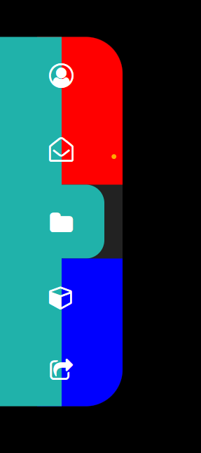
那我们实验一下,如果没有 bottom,效果是:
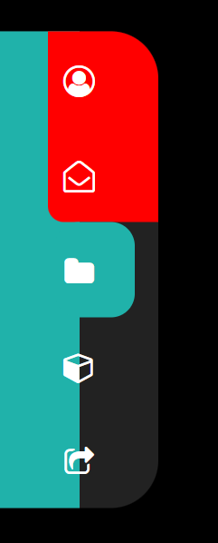
对比一下,有什么不同?
!对,最后两个滑块有一半变成了绿色,就是说 container::before 的块突出来了。
我们再看看源码,发现 before 的 width 是 50%,不是一个固定的 px 值,会随着 container 的变大而变大,始终占 container 的 50%。而 li 标签是居中的,那么必然会和 before 块有重合。那样不好看呀,不是我们想要的。所以我们拿了一个 bottom 块来把 before 块给重叠覆盖住。
注意:不是挤压,因为这几个块不是 flex,并且 before 在 bottom 块之前,要挤也是 before 挤 bottom。
(下图我把 before 置于底层取消了,验证了我的猜想)
小结
- 这个例子来自 b 站:HTML5+CSS3 小实例:隐藏式侧边栏菜单
- 模仿的时候一定要认真思考每一行代码的效果,每一个模块设置的原因!不懂的地方就改代码验证。
- 小组件也很考验前端实现逻辑,也很有思维含量~
- 举一反三,横着的菜单也该会做了